2025
Timeline
1 week
Platform
Multi-Platform (Automotive HMI · Mobile · Smart Home)
Role
Product Designer - System Design & Visual Design
Year

Information Through Ambience
This project was created as part of an interview exercise to explore system thinking, scalability, and visual consistency under tight time constraints.
The goal was not to design a single interface, but to define a reusable system that could operate across multiple high-density environments including automotive dashboards, smart home interfaces, and financial tools.
However, the same constraints exist in other domains smart homes, financial dashboards, and ambient displays where users interact peripherally rather than directly. Echo was an attempt to create a unified system that could scale across these contexts while maintaining clarity, efficiency, and visual coherence.
SYSTEM DESIGN
OLED-First Foundation
The system uses a near-true black base (#050505) to leverage OLED pixel shutdown, improving contrast while reducing power consumption.
Semantic Color System
Color is defined by function rather than appearance, using semantic tokens such as Nominal, Warning, and Critical to maintain consistency across contexts.
Ambient Feedback System
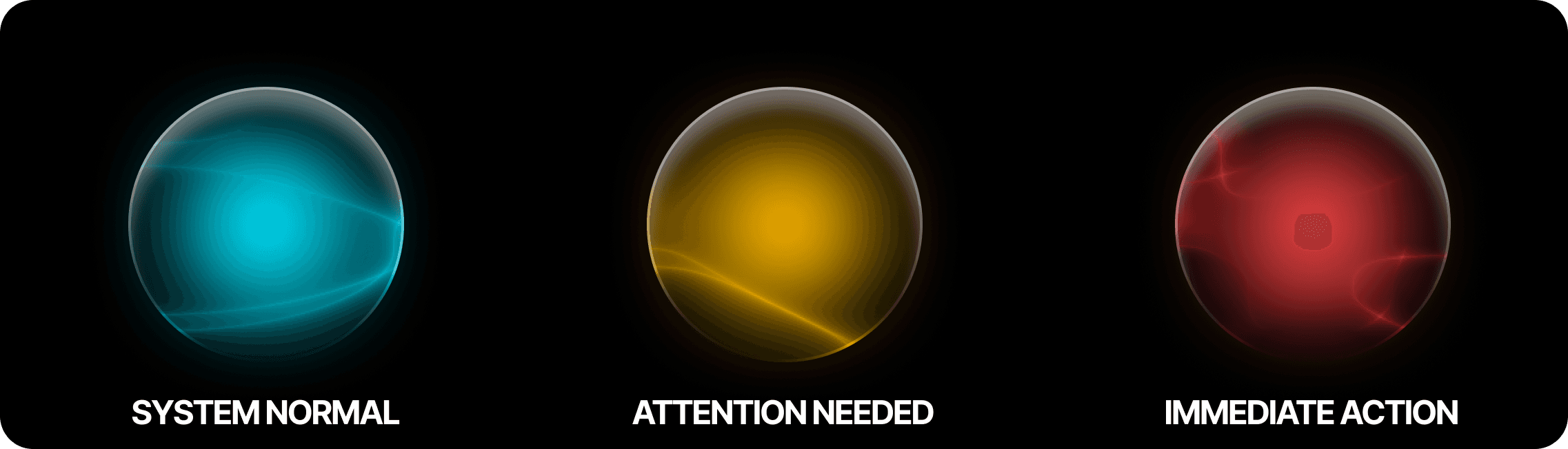
System states are communicated through controlled glow and blur, allowing users to understand status passively without relying on alerts or dense UI.
Modular Component System
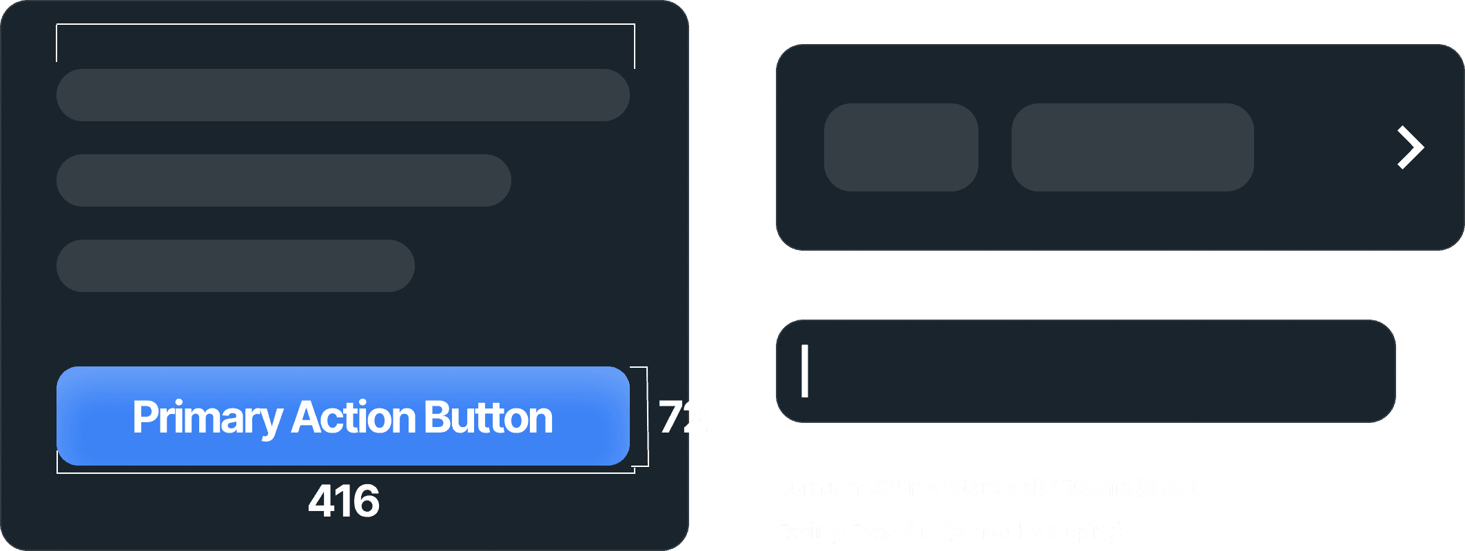
Reusable glass-based components act as containers for multiple data types, enabling consistency and scalability across devices and use cases.
EXPLORATION & ITERATION
Before defining the final system, I explored multiple approaches to visibility, contrast, and information density in low-light environments.
Contrast Exploration
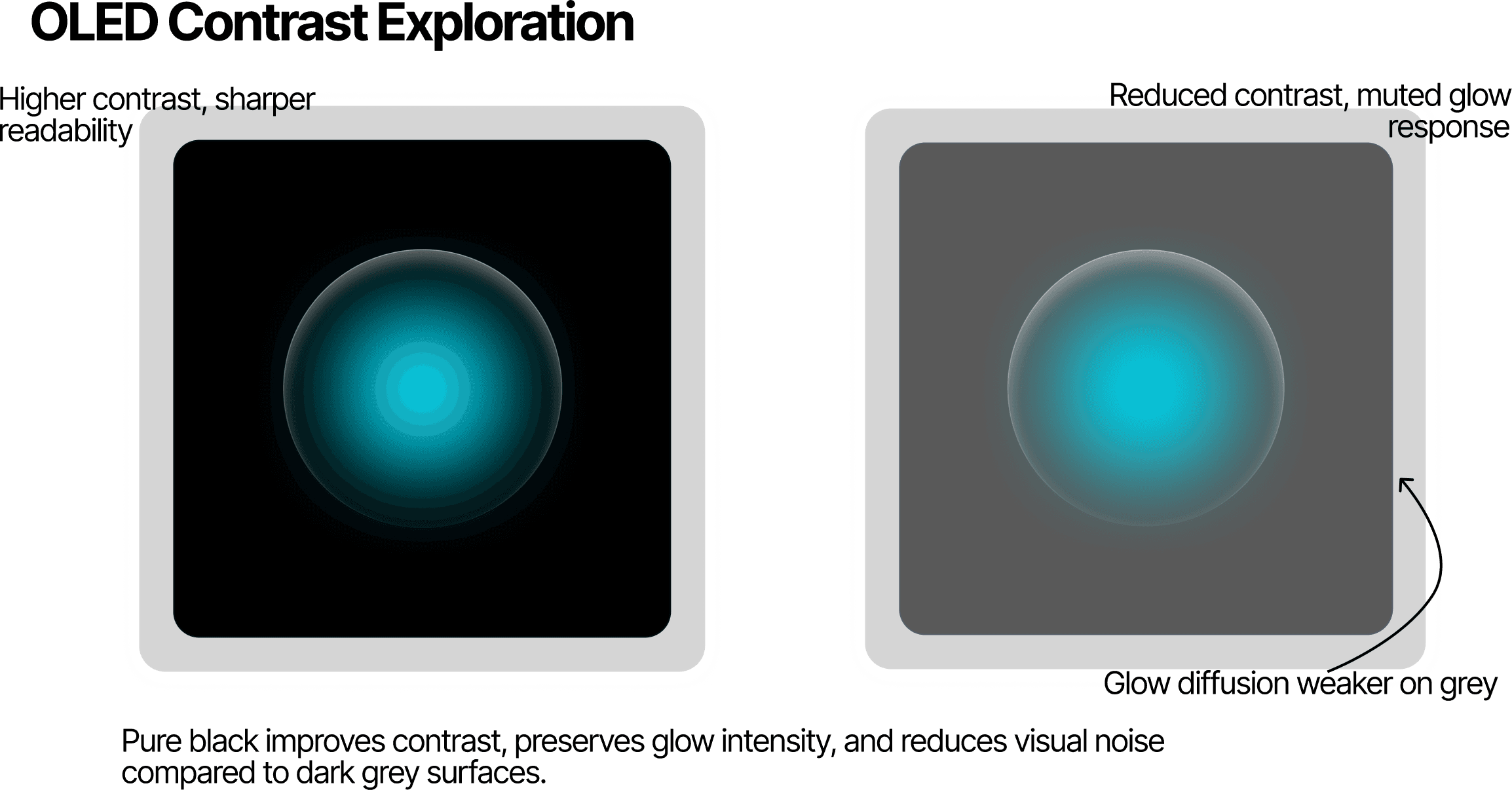
Tested different black levels and grey bases.
Standard dark greys reduced contrast on OLED displays, making elements feel muted and harder to distinguish.
This led to the adoption of a near-true black foundation to improve clarity and reduce visual noise.
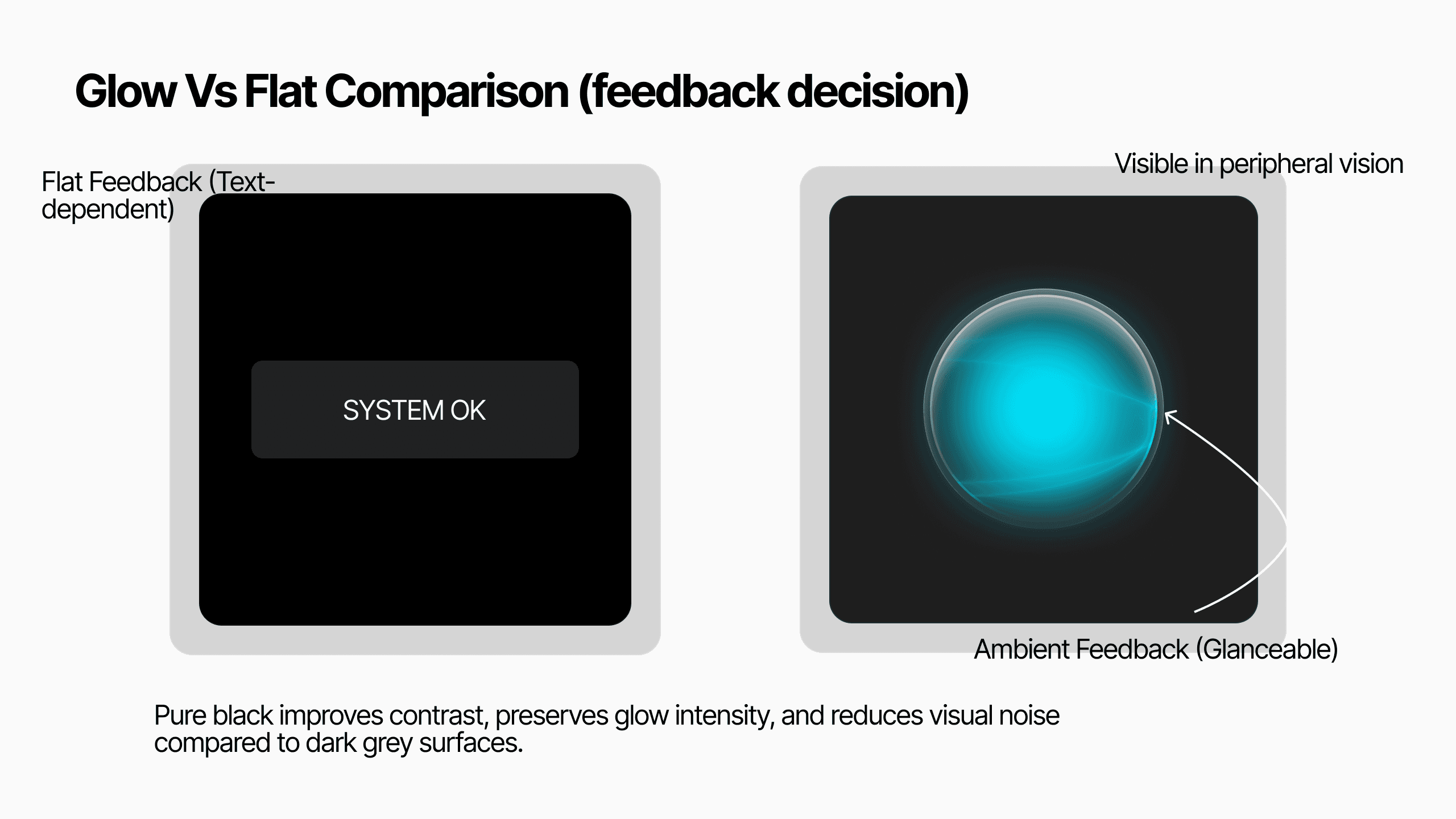
Glow vs Flat Feedback
Explored traditional flat indicators against glow-based feedback systems.
Flat UI required active reading, while glow states could be understood peripherally.
This led to an ambient feedback system that communicates status without interrupting user focus.
Density vs Clarity
Tested high-density dashboards against modular layouts.
Dense layouts increased cognitive load, especially in low-light environments.
This led to a modular component system that chunks information into readable units.

USABILITY CONSIDERATIONS
Usability decisions were guided by established interface principles and platform conventions.
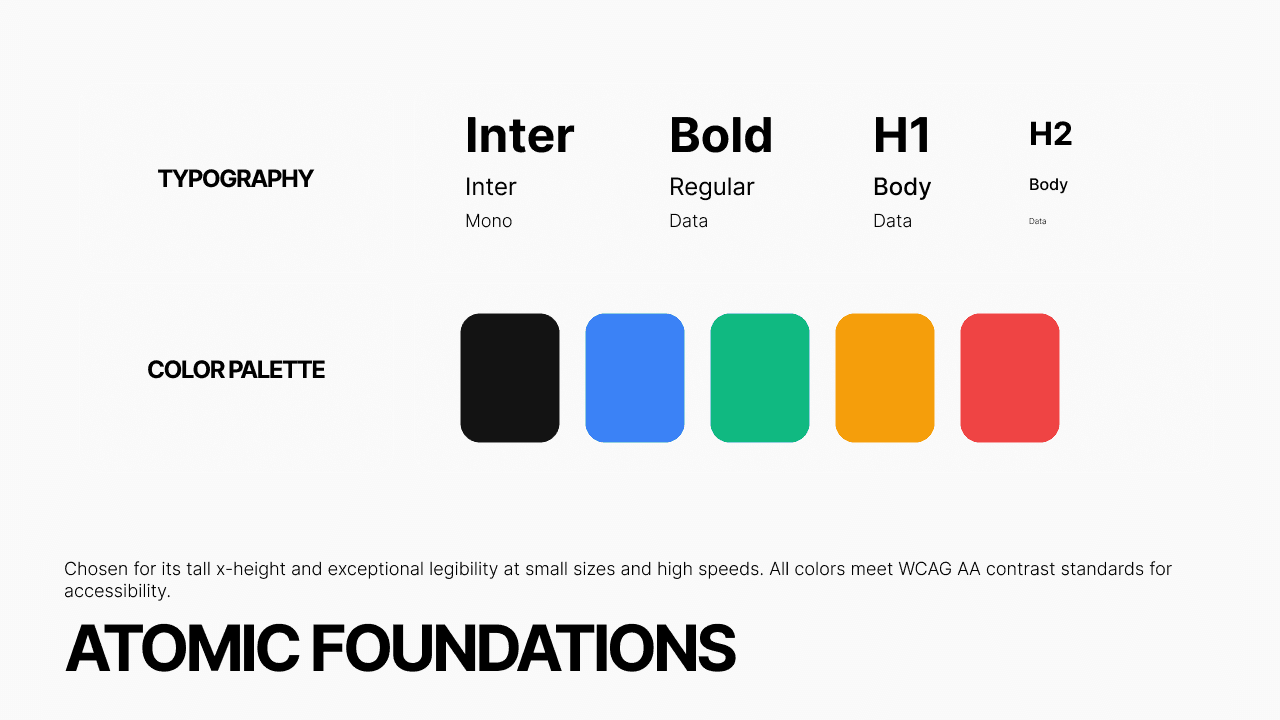
Typography : Used Inter with tabular figures to ensure numerical clarity and consistent alignment in data-heavy interfaces.
Touch Targets: Primary actions are designed as large, accessible touch targets to support interaction in motion-based environments.
Contrast & Visibility: Contrast levels were carefully balanced to maintain readability without introducing glare or visual fatigue in low-light conditions.
The system was applied to a smart home interface to evaluate how ambient feedback and modular components behave in a real-world context. The goal was to ensure that system states could be understood at a glance without requiring active interaction.


Applied Scenario : Smart Home Interface
The system was applied to a smart home interface to evaluate how ambient feedback and modular components behave in a real-world context.
The goal was to ensure that system states could be understood at a glance without requiring active interaction.
Outcome
• Established a consistent visual language across multiple domains
• Demonstrated how ambient feedback can reduce reliance on text-heavy UI
• Designed a system with production-level considerations for scalability and reuse
Design Tokens
The system is structured using reusable tokens for color, typography, spacing, and motion to ensure consistency and scalability across platforms.
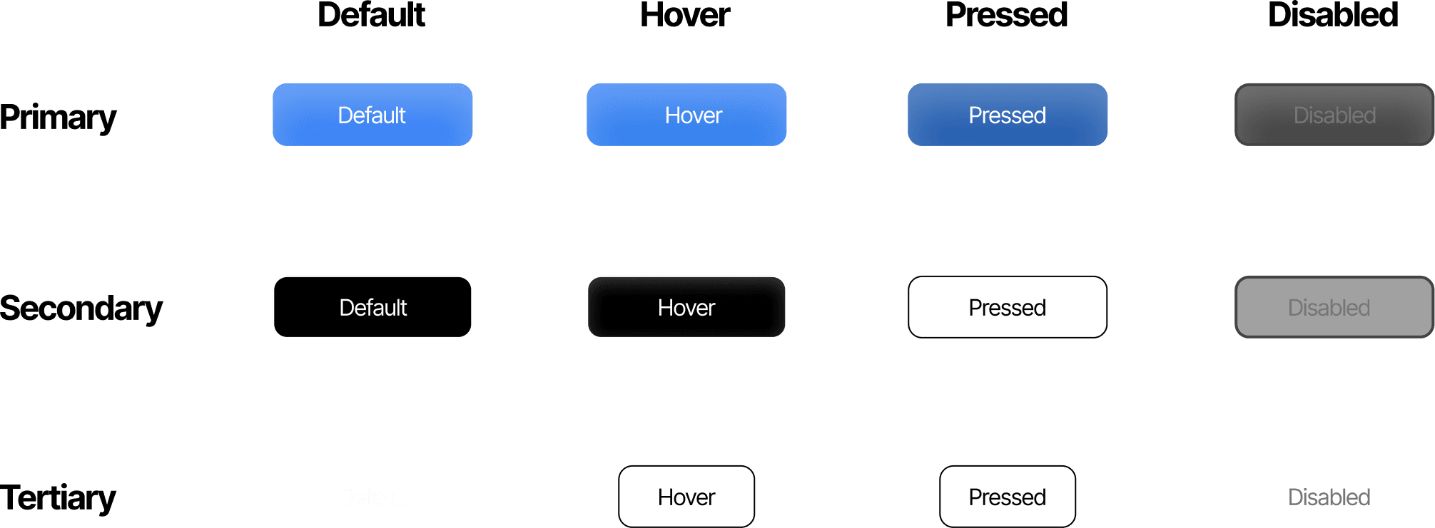
Component States
All components are designed with defined states including default, active, disabled, and critical ensuring predictable behaviour across interactions.
Multi-Device Adaptation
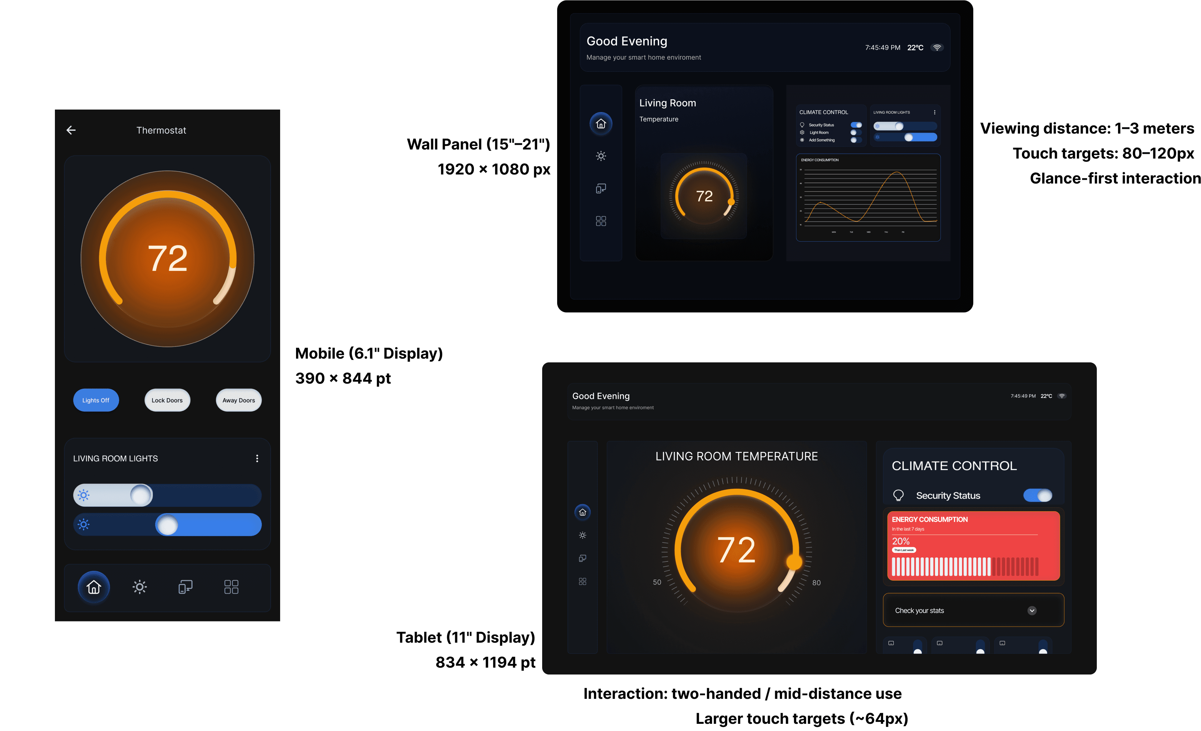
The system is designed to adapt across multiple environments, from glanceable automotive dashboards to touch-based mobile interfaces and ambient smart home displays.